Building interfaces with SwiftUI is like having a great drummer in your band. Don’t worry if you don’t know what SwiftUI is. We’ll get there. First, let’s talk about drummers.
Drummers are vibe machines. A great drummer hears a song and knows what it needs in order to feel the way it should. When you’re playing with a great drummer, things come easy. Sure, you have to learn to speak Drum, but the basics of Drum are pretty simple. You just give a couple suggestions about the feeling you’re going for — “this section should be heavy but not draggy” — and the drummer takes it from there. In the software development world that’s called declarative programming.
When I first started working on Albums, the only option for building a user interface was UIKit, which is an imperative framework. Imperative frameworks are great for control freaks. They’re super powerful, but you spend a lot of time defining every little thing. This list of content has exactly 16 items, and each item in the list is exactly 44 points in height. Unless someone is using an Accessiblity font size, then it’s 88 points in height.
SwiftUI, on the other hand, is Apple’s new(ish) declarative UI framework, and boy howdy do I love it. With SwiftUI you just say, “I’ve got a list of some stuff. The amount might change and each item should adjust to any font size.” From there, SwiftUI just kind of figures it out. For the most part, like a great drummer, it compiles everything into the right vibe.
Sometimes you have a more specific idea of how a song should go. Luckily, Drum is a robust enough language that you can get specific when you need to. Only drummers truly speak Drum, but after a wile you learn enough to get by. “The transition needs to go bao-brrrat-dug-dug-brrrrrrat. And don’t get louder than, like, a six.” Similarly, you might tell SwiftUI “Don’t make this image larger than half of the width of the screen, and only display the first two lines of this text.”
Every so often, though, no matter how you try to communicate your suggestions and your specifics, the beat SwiftUI is playing just isn’t the one you hear in your head. The song might even be better for it. But sometimes, damn it, you’re the songwriter. This is your song, and you know how you want it to sound.
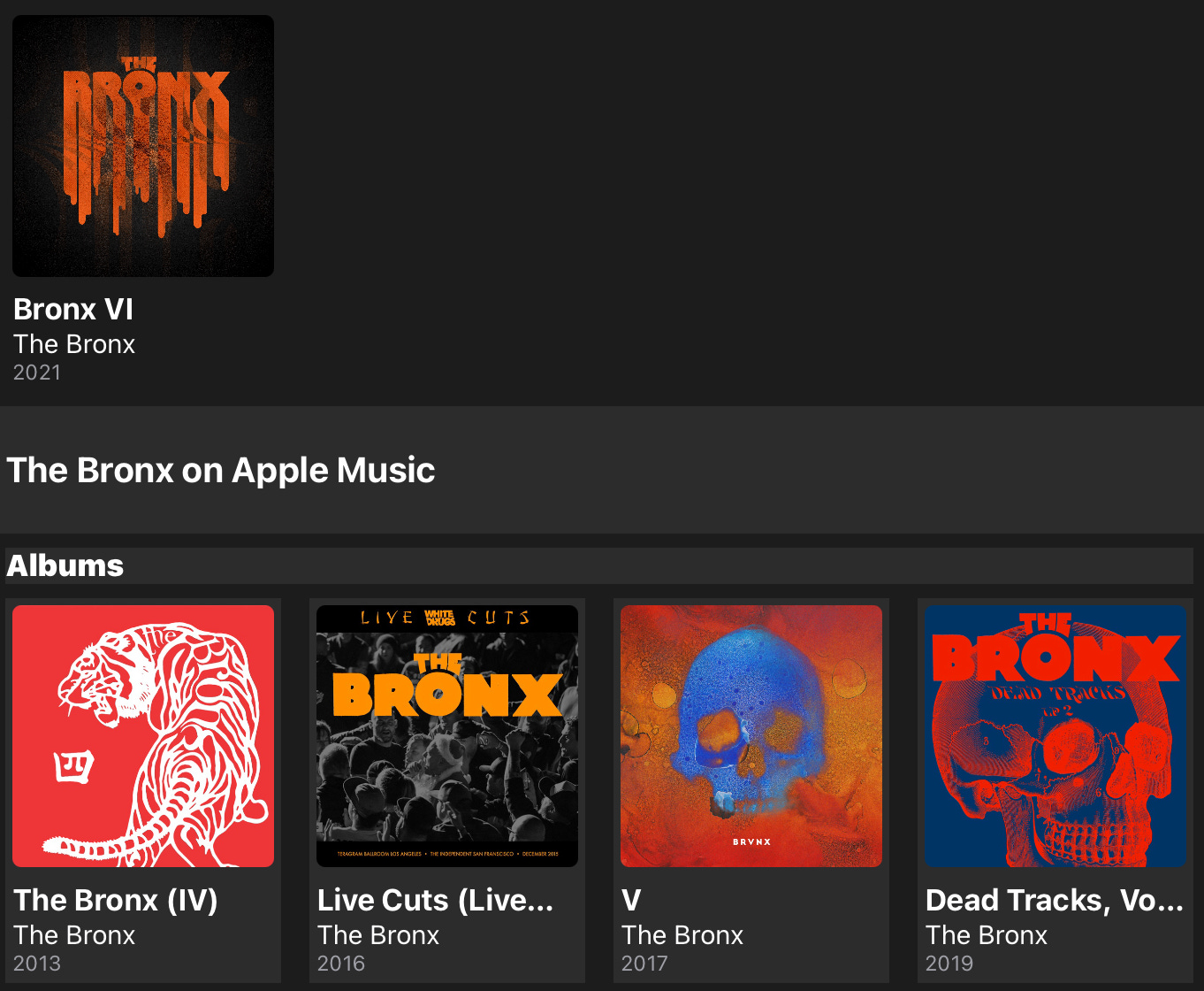
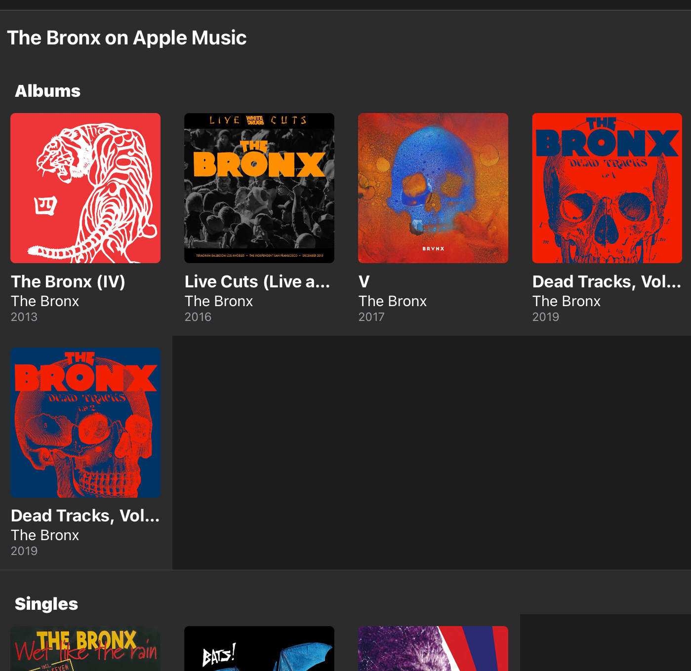
This brings us, finally, to the main Collection display in Albums. In 4.0, I rewrote it in SwiftUI and added support for viewing an Artist’s albums that aren’t in your library. All I wanted, more than anything, was for the section of albums in your library to have a different background color from the section with the ones that weren’t. I spent — no exaggeration — at least 8 hours over two days pleading with SwiftUI and getting results like the below image. In the final release, I gave up and made the two sections the same color. It’s bugged me ever since.
While working on some new Apple Music features for 4.2 (and desperate for anything to distract me from pushing the iCloud sync boulder up the mountain), I resolved to make another attempt. It’s never pretty, but sometimes the only way to make that beautiful, unknowable drummer brain understand what you’re being so stubborn about is to sit down behind the kit, break down your idea into its absolute smallest component parts, and try to play it. Kick. Snare. Rest. Rest. Kick. I know you want to hit the snare there instead. I know. Just… please…
After another couple of hours of futzing, I got it this time. I told SwiftUI, “yes, we’ve got a grid, but kindly please forget everything you typically like to do with grids.” Instead, each grid item has individual spacing and styling to make it look like one coherent grid. When I got as far as the below image, I could hear SwiftUI taunting me, “I told you, man, I can play it but it doesn’t sound right. The guitar part ends too early.”
But I know what you do when you need to fill a little space as a guitarist: a big, dumb pick slide. In Albums 4.2, coming later this summer, the Collection screen finally has different background colors for the different sections. How? I created some nameless and artless dummy albums behind the scenes. If there aren’t enough non-library items to fill a row, it simply loads up the requisite number of dummies to fill the remaining space. Dumb, but it works.
See you in two weeks.


